This is my posting of a variety of works using both Photoshop CS5 and PSE8 [Photoshop Essential 8]
Main (1) Titled-Abstract Art
A series of photographs layered on top of one another to a total of 10, and each layer has a portion erased. A rather unique way of photo-manipulation when one has practically pulled out their hair over the settings and has had a creative dead moment. [Done in CS5]
See further down for the rest of titled works.
This is what fleas look like when they have too much coffee in the morning. [Done in PSE8]
Ah remember those 1940-1950 films? [CS5]
Adjusted and then brushed with light opacity set brushes, four seasons in one. [CS5]
This one is a rather subtle mix, instead of using the normal settings I used the brush tool to adjust the photos with a light transparent coating of a choice of colors. This reminds me of my childhood forays into railroad modeling magazines which used such Photoshop techniques for diorama and photo backgrounds. [CS5]
If Granny needs some work done for the Christmas cards, so one doesn't think you're sending Halloween greeting cards, you can now do some visual Botox! [CS5]
No one knows where Bob and Jim went, at least that is the story that the local art students are sticking to. (Our teacher told us to do it!) [CS5]
Experimentals: Random Materials and Concepts. [RMC]
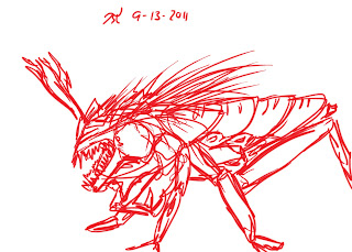
Environmental Demon-this is a rather unique project. Using a Line Drawing to create a unique cutout work. [Drawing was done by hand, and photomanipulated in PSE8]
Project R1- one of my interests is experimental works with a tablet, which I prefer for better control and creativity over the mouse. Was done with various brush and settings. [CS5]
Main (2) Titled-Ghosts of the Forest
A series of photographs and artworks layered upon one another and manipulated to create a seamless environment. Brushed with two variations of brush in color dodge mode...to create the ghosts. [PSE8]
Main (3) Titled-Girl Power
Actually a three layer design using a pre-adjusted jpg...then a cutout artwork was placed ontop. Then selecting "meat" layer [think sandwich] added a photo tint...overall yellow. Then erased from underneath the cutout drawing to the background which was solid white. Then using a brush I filled in spaced around with skin tones...which are modified by the tint layer. [CS5]
This is a rather odd ball concept using an atypical program for my class. Corel Draw Essentials 4.
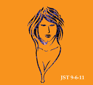
Hair of Glory- A free handed tablet sketch concept using PSE8
Oddly enough the shark photograph is quite popular with vacation postcard designers in Florida. Their design reads "Send more tourists to Florida!" Done using a cutout drawing and photomanipulating the backgrounds and layers. [CS5]
Who is winning I do not know. A concept done using a cutout drawing and layers. [CS5]
Main (4) Title- Portal of the Mind
I wonder what goes on in my mind. I used various photo jpg, layers, gradient adjustments, and etc to pull off this. The two fish are Cutout artworks drawn on white paper then manipulated with Photoshop selection tools. I wanted a rather unusual inverted artwork concept. [PSE8]
Main (5) Title- Subliminal Message Duck
This is the extent of my humor, what happens when you get ideas of subliminal messaging and a rubber duck. Oh the inhumanity, I wonder if some lobbyist group supporting Rubber Duck manufacture will get me for this? Turns on the song "Rubber Ducky" by Little Richard. (Maybe I should have labeled it Ducky Apocalypse but I don't think that would fly.) [CS5]
Main (6) Title- Walking on the Wild Side
A multi-layer combination of photos, layers, brushes, artwork, and tint/gradients. Various concepts and ideas were combined to create this. When I started this I didn't quite understand how to operate the layer adjustment functions, but after this set it works now. [PSE8]
Underworld-A brush sketch in PSE8 with stark contrast. [PSE8]
Unnamed Sketch-Mimics ink wash/charcoal with a brush. [CS5]
Main (7) Title- Butterflies of Doom
Well, humor again..."Nothing says Apocalypse like a Butterfly"-so says my teacher. [CS5]
Death from Above- you know when some one sees the new A-team movie once, and it somehow affects his ideas. [CS5]
Cutout Test 1- My first attempt at using one of my drawing sketchs to create a cutout picture. [PSE8]
Special Note: If you are using PSE8 the shortest way to rasterize and simplify a smart object is using the eraser. It immediately pulls a notification that allows you to auto-rasterize objects with little searching for the proper attachments adjustments. However, PSE8 also has a downside, the layer adjustments act like a cap on the whole project...so trying to paint or add something ontop will cause an auto flatten notification in order to continue an operation. In comparison PSE8 has certain advantages and disadvantages over CS5, although CS5 has the larger set of tools and abilities and presets to use. PSE8 is more problematic with certain functions but even with those you can use some creativity to overcome such shortcoming. So the majority of my at home projects will be done on PSE8, and class work will be in CS5.
J.S. Tribble 9-14-2011 Posted 10:19CAT


I like the first image, I just wish that it would have covered the edges too..
ReplyDeleteThe first one is very interesting. I like how you can still see things in the background. Very interesting technique
ReplyDeleteI get a feeling for the oriental paintings and designs. Like the mosiac feeling I get from the strong mix of colors.
ReplyDelete