This is my completed Money Project.
I went with a rather unique combination of industry and nature themes together. My initial project aspirations was for the development of a square type money design for practical use. The design as shown to is 4x4 inch square. However the design as used by the public would be developed into a 3.5x3.5 inch square or a 2x2 inch square. The reasoning is that most designs for presses are rectangular [hence lower counterfeiting], but also a saving on production and space with overall design. Current rectangular bills are nearing a functional end. Also this technique could be used for smaller "bills" to create fractional currency. [ieg. paper "coinage"] Under 1x1inch squares or smaller.
Also the design will use the most modern methods of holographic imprint and Mylar sheet design...to create a virtually indestructible "paper" [because Mylar is a thin durable plastic like material.] that has inbuilt textures that make counterfeiting nearly impossible. Add to this...that a small novel alloy chip will be put on the corner of these squares. Which with its degradation and aging help authenticate the money to banks and commercial interests.
1 Dollar Bill.
5 Dollar Bill
Note: the front of the 5 Dollar bill is left on purpose with a single bar at its base. Such techniques can also frustrate counterfeiting, by incorporating non-standard variations of bill type to frustrate counterfeiting or make detection of counterfeiting operations far more easy for authorities.
10 Dollar Bill
20 Dollar Bill
50 Dollar Bill
100 Dollar Bill
Also one needs to note the effort for all bills to have distinctly different denomination markers in unique shapes. Also color patters between the classes of monetary groups are unique. Yellow is a low denomination group bill or "change"bill. (1 and 5.) Blue is a mid denomination group bill...and makes up the majority of economic transactions in the economy. (10 and 20) High order denominations are uniquely colored to differentiate between their usage. The 50 is a "change" bill for the 100 bill. So its color denotes a lesser value. The 100 bill denotes its the highest bill transacted in the economy, so its color scheme and bill value marker are highly unique, but its color also denotes it is not a mainstay bill. (versus the blue 10-20 bills.) Color coding and design of a bill helps both consumer, producer, importer, and exporter determine the value of the bill on sight.
RAW Materials
These are the bases for materials within the bills. Hand created symbols and codes designed specifically for use. This makes counterfeiting even harder since the flaws of the artists and transfer bleed over to the bills. Also as time changes so does written codex of the time. So twenty years from now, the style of iconography will be similar, but totally unique. [Unlike any codified and rigid alphabet based system in the European sphere. More akin to the evolving style of Asian, African, and Middle Eastern writing styles and codex. Examples being the Chinese and Japanese calligraphy which changes only slightly over thousands of years looking at the modern era totally unrelated to modern writing, but it can be read due to its evolved style. And the shapes being understood as the pro-generators of the modern design.]
Paned Glass
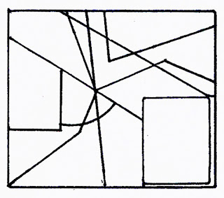
The Paned Glass effect was done with a stencil sketch to create the individual panes.
Random Design for the day
"Order Out of Chaos"


No comments:
Post a Comment